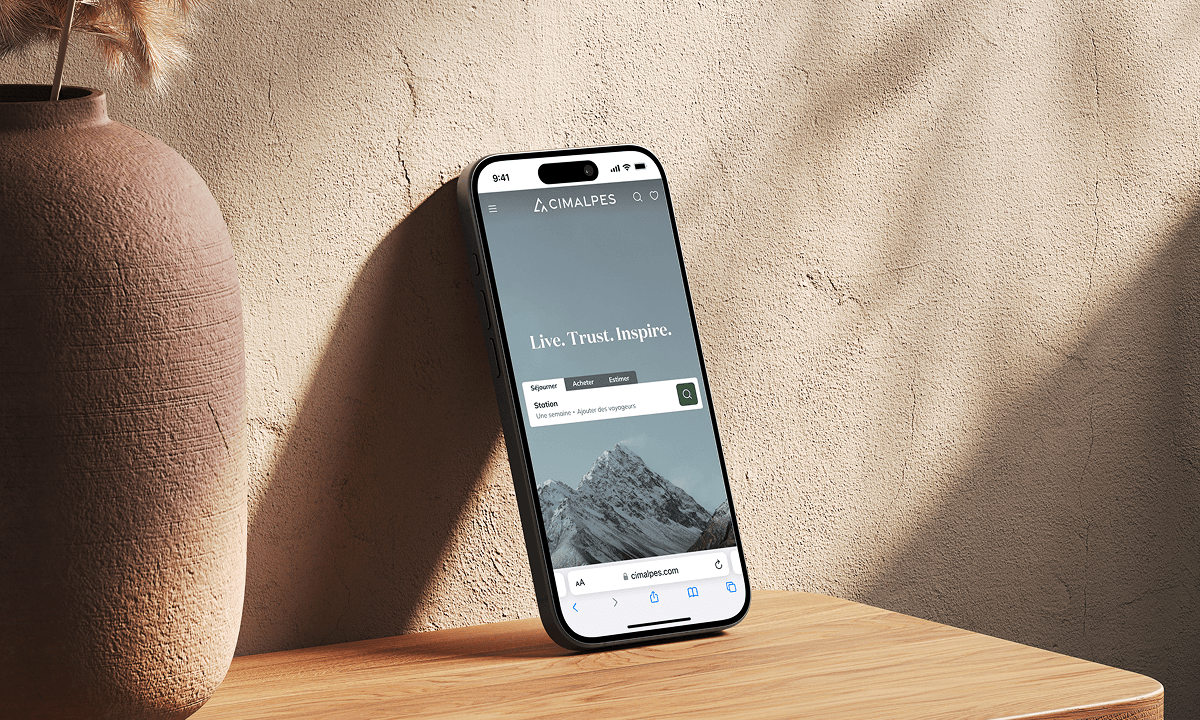
Redesigning a product page for high-end stays
Timeline
Sep 2024 - Mar 2025
Expertise
UX Research, UX/UI Design, Prototyping, Product Strategy
Role
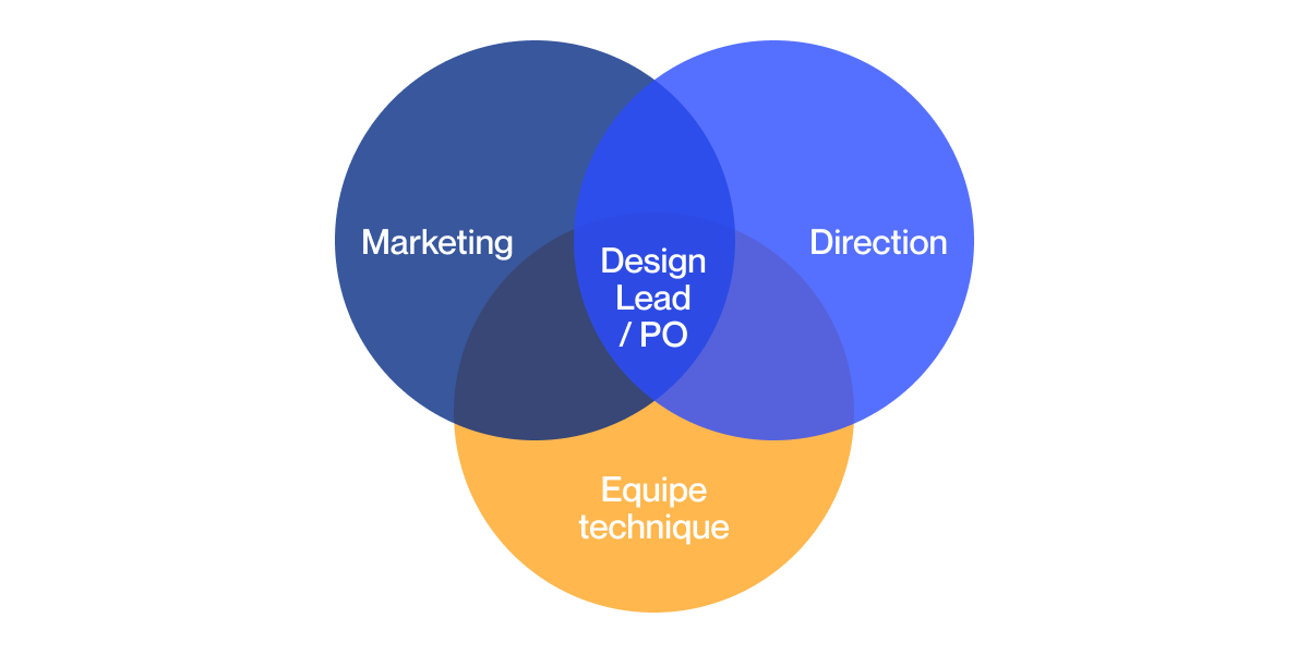
Design Lead + PO
Status
With NDA
Overview
Acting as Design Lead with a product-focused approach, I worked to modernise the interface and align the high-end experience with the brand’s image.
The goal: an inspiring page that facilitates conversion while reinforcing the premium identity.
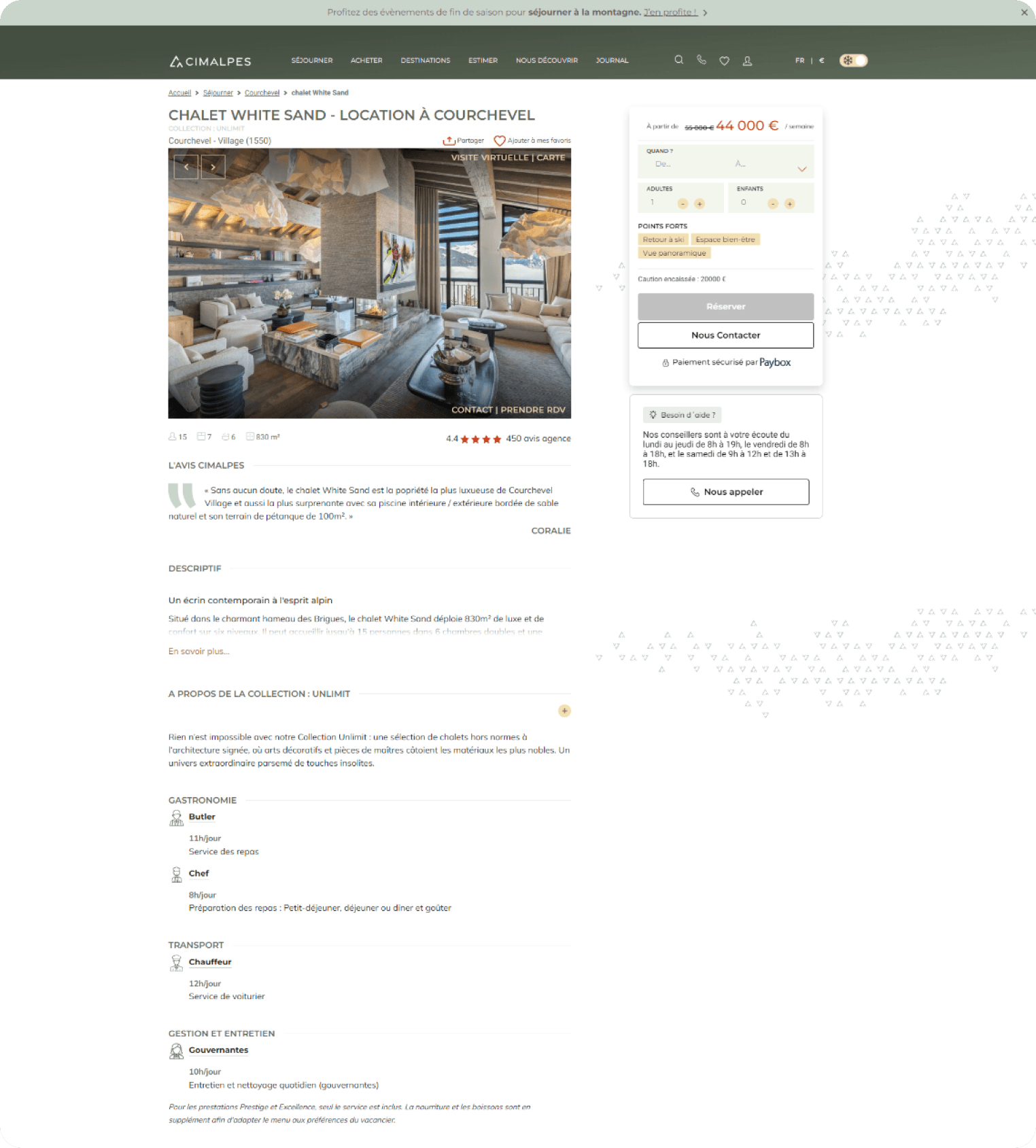
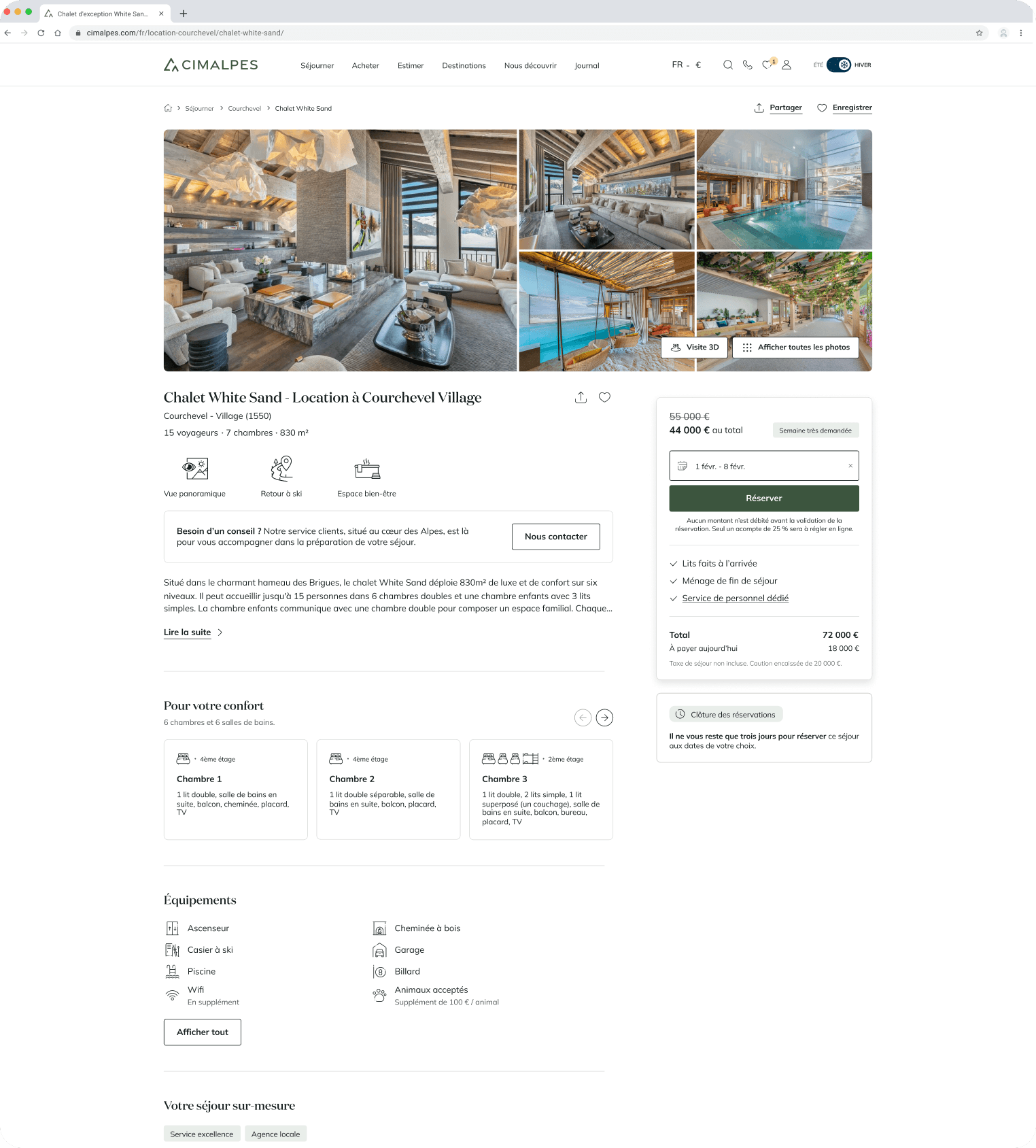
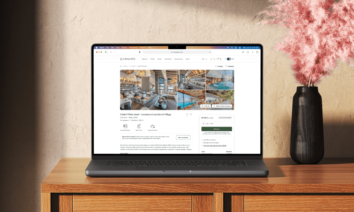
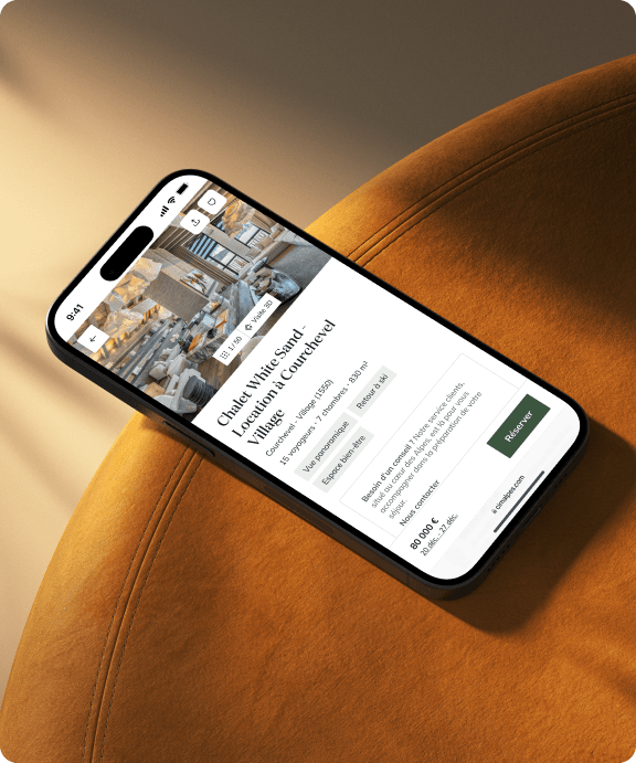
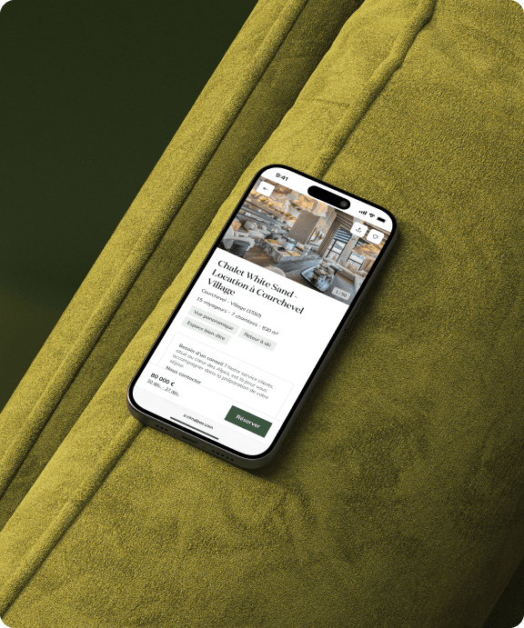
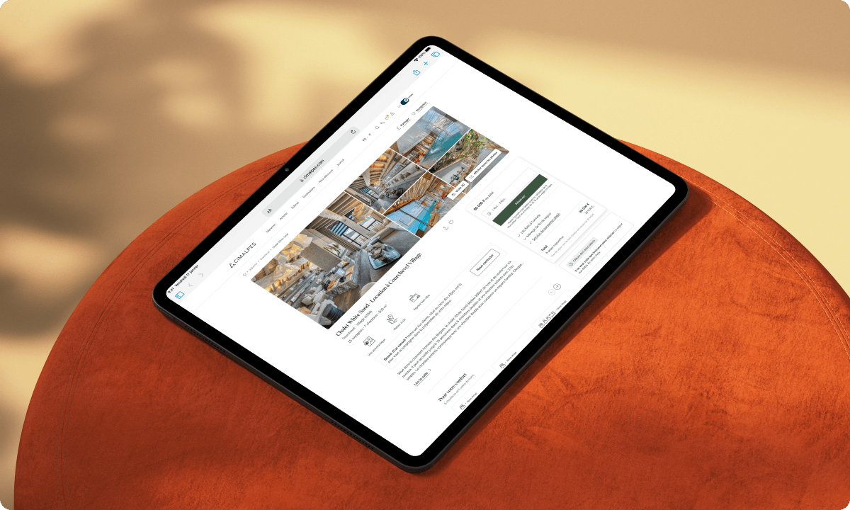
Desktop - before/after
Context & challenges
The product page is a strategic decision point: it’s where users choose whether to proceed with a booking or leave the journey. The previous version lacked clarity and didn’t fully reflect Cimalpes’ luxury positioning.
Users’ expectations were clear:
- a straightforward hierarchy of key information (price, location, availability),
- immersive visuals to help them project themselves,
- a smooth path to action without having to “hunt” for essentials.
The project also had to meet tight deadlines while working within technical and marketing constraints.

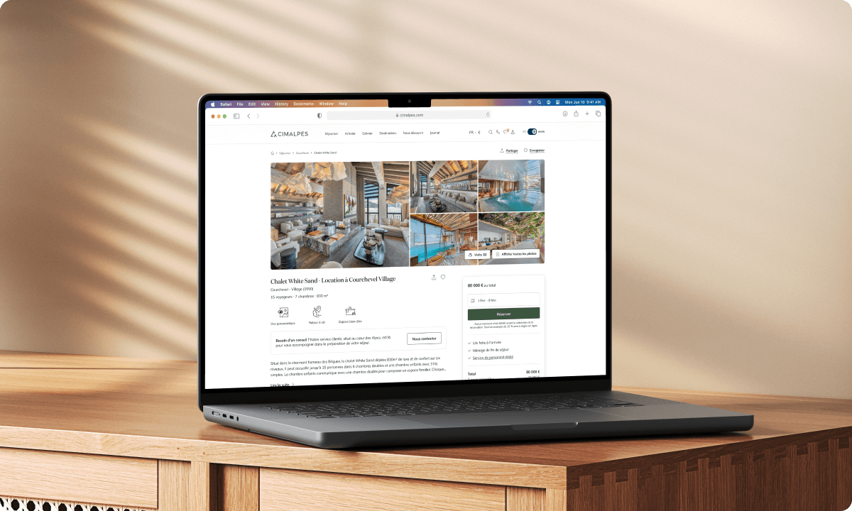
Current page showcasing a chalet
Research & insights
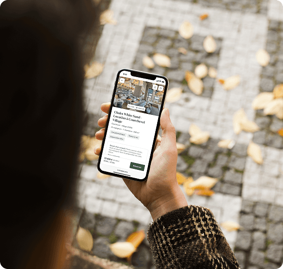
To better understand user needs and expectations, we combined three quantitative methods (5-second test, card sorting and analytics review) with 20 usability tests in French and English, on both desktop and mobile.
Quantitative research
The 5-second tests revealed that the top of the page was perceived as “too cluttered” and “uninspiring”: several participants struggled to identify key information at a glance.
The card sorting showed that some sections, such as staff reviews, detailed room layouts, and agency information, were considered unnecessary or biased. On the other hand, participants suggested integrating traveller reviews, as well as details about amenities and local activities, which they found useful to better prepare their stay.
Finally, the analytics review, although limited due to a lack of KPIs previously set up by the company, indicated that product pages generated 58% of contact requests (just over four per day). Users particularly valued the visibility of contact buttons and the simplicity of the form.
Participant feedback regarding the reviews written by the company
Qualitative research
During 20 usability tests, patterns quickly emerged: many users looked first for the price and location but had to scroll far before finding them. Others got lost in secondary sections and dropped off.
These observations confirmed the need to surface key information earlier and to make the page more inspiring from the start.
Virtual tour
80% of participants preferred direct access to the virtual tour rather than scrolling to find it.
Photos
Users wanted an easier way to swipe through images and felt the lack of room labels made it harder to identify spaces.
Contact
The "Contact" button was seen as intuitive, while "Request an appointment" caused confusion.
Wellness amenities
Most participants had difficulty identifying the hammam and felt these spaces should be better highlighted.
Contact preferences
When online booking isn’t available, phone remains the preferred contact method.
Information overload
Some found textual content excessive, suggesting a need for concise, scannable layouts.
Redesign objectives
The objectives were threefold:
- UX: clarify the content hierarchy and inspire users through immersive visuals.
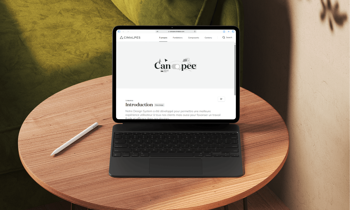
- UI: modernise the interface with the new digital identity, including updated colours, typography, and a design system co-designed with the junior designer I was managing.
- Product: reduce drop-offs, increase contact requests, and strengthen the brand’s premium image.
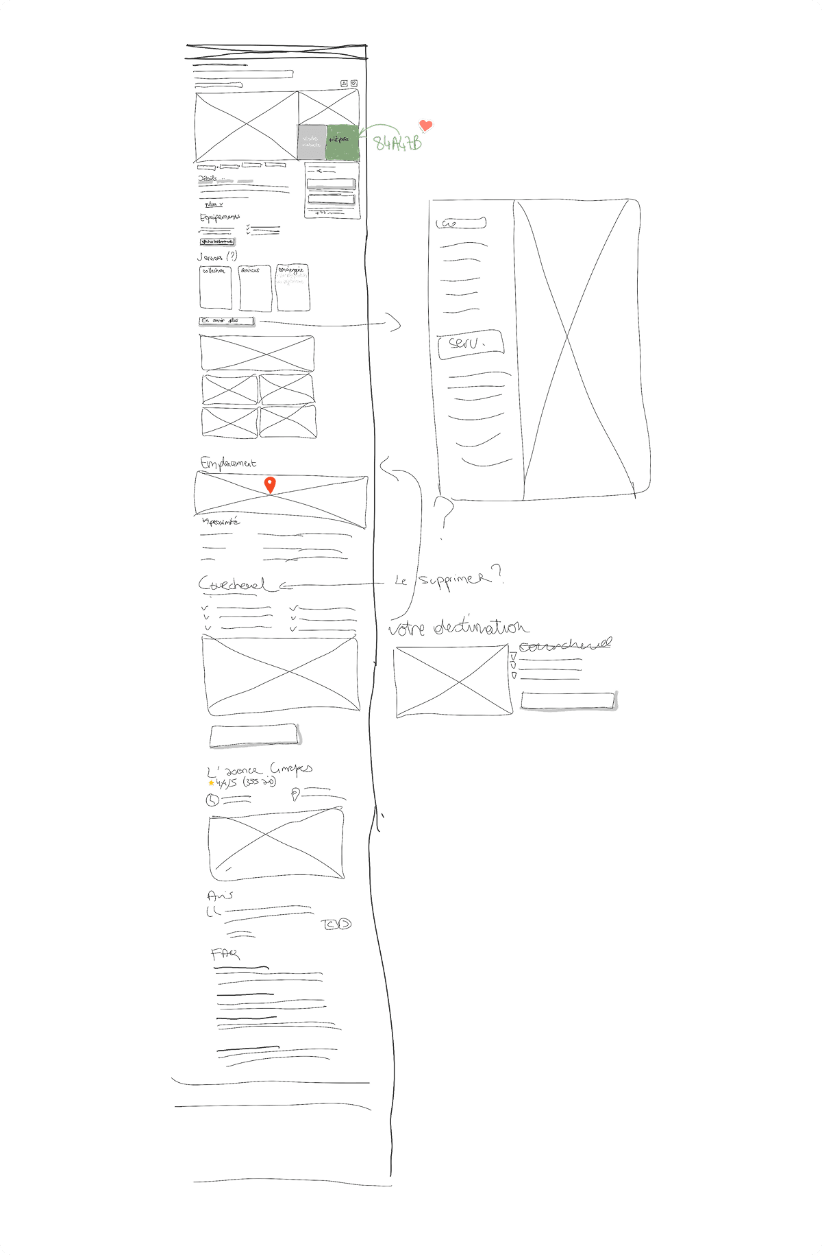
First wireframe, designed on an interactive screen during a collaborative workshop
The solution
To meet these objectives, we rethought both the structure and the presentation of content to create a page that is clearer, more immersive, and more in line with Cimalpes’ high-end universe and the unique character of each property.
- Clarify essential information
Key information now appears at the very top of the page: price, location, number of travellers and highlights. On mobile, the structure was simplified to concentrate on the essentials within the limited screen space. This reorganisation, supported by a unified design system (typography, colours, spacing...), makes reading easier and highlights the “Book” button to encourage action.
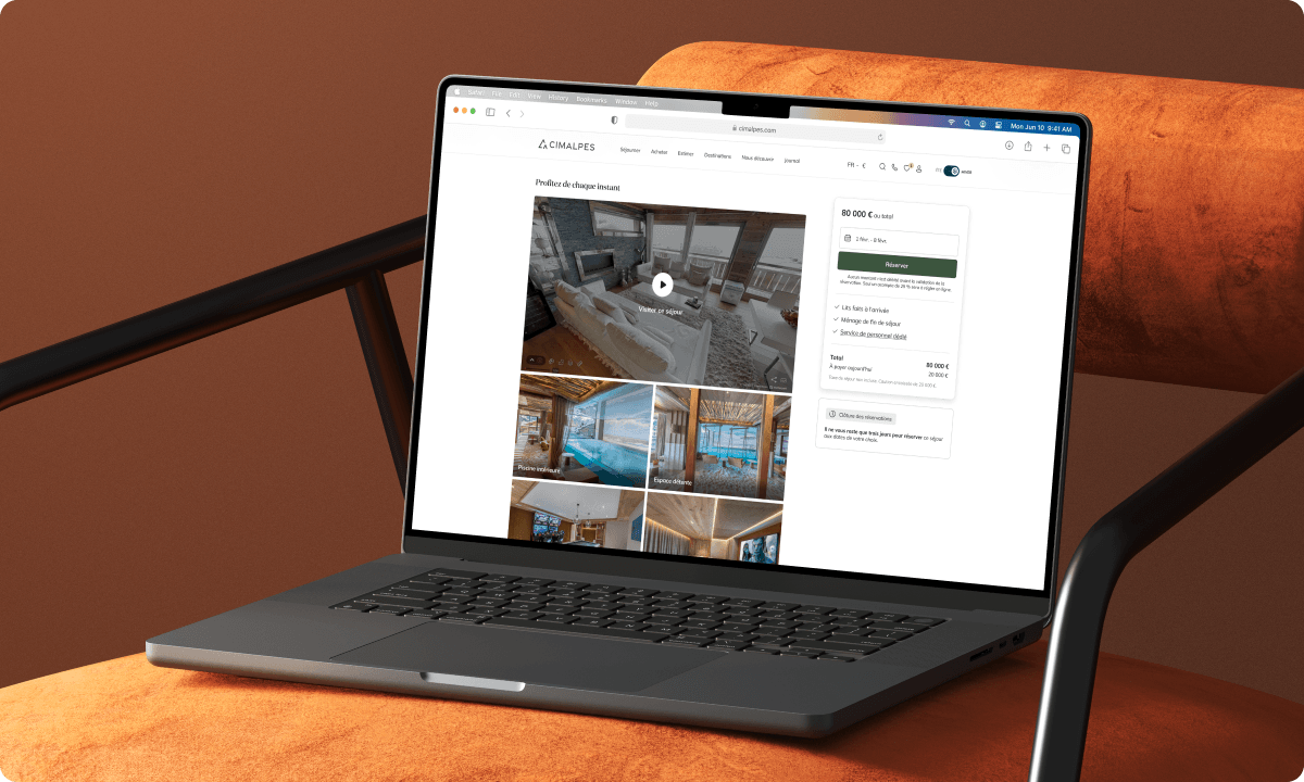
- Strengthen initial visual impact
The top photo gallery was redesigned to deliver a stronger first impression: widened on desktop (five images visible), it immediately sets a premium tone and captures attention as soon as the page loads. - Create an immersive experience
Further down the page, dedicated visuals highlight exceptional spaces (pool, spa, gym…). These differentiating features partly explain the price and strengthen the uniqueness of each property, helping users picture themselves in the property.
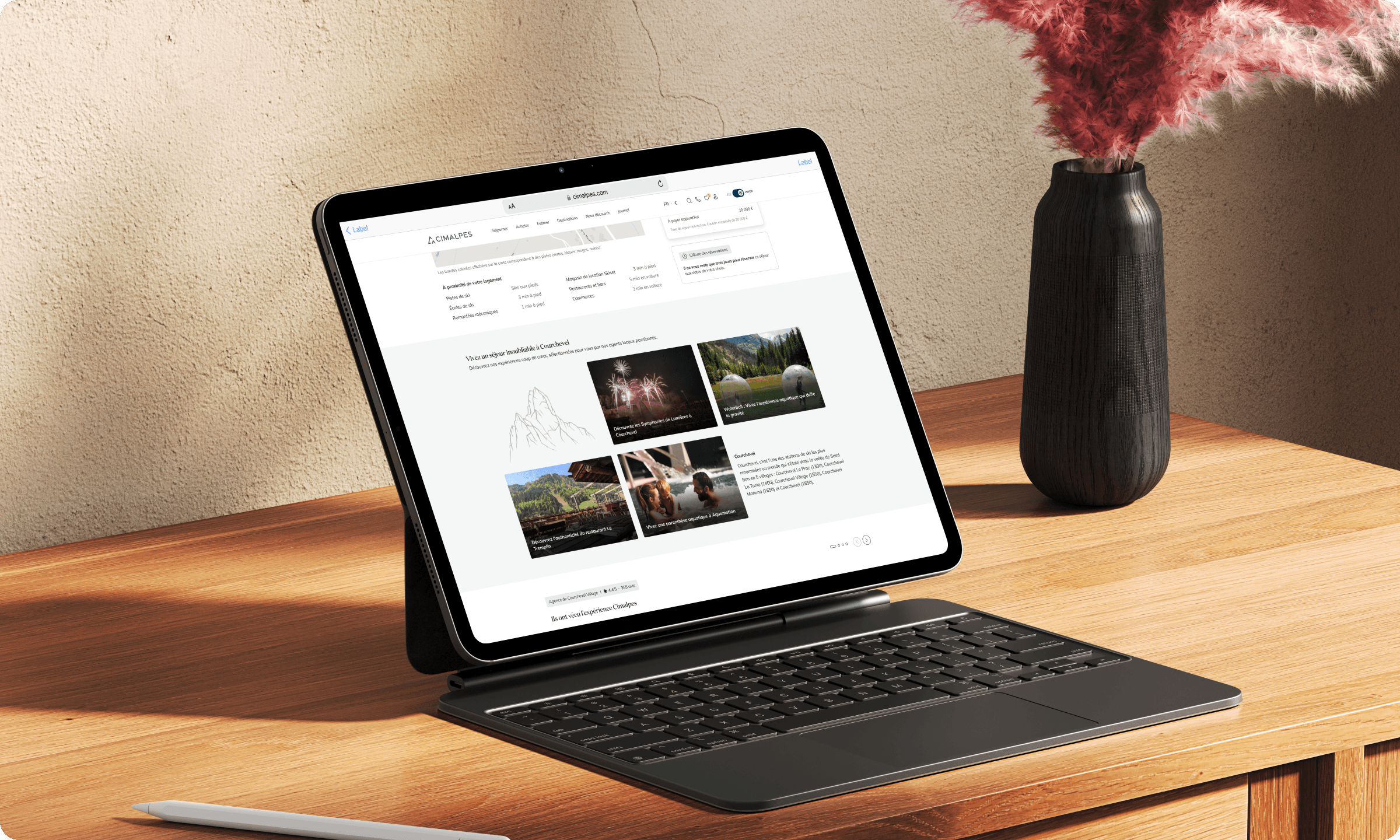
- Highlight complementary content
Adding information on local activities and events enriches the user journey. The aim is to offer a complete view of the stay: users discover not only the property, but also its lifestyle and surroundings.
With virtual tour
Without virtual tour
Collaboration
The project brought together several stakeholders:
- Marketing, to ensure brand alignment,
- Management, to validate strategic choices,
- Technical teams, to secure smooth integration.
As Design Lead / Product Owner, I acted at the crossroads of these teams. Decisions were made through quick iterations, prioritising what delivered the most user value while remaining within the given timeframe.
Conclusion
The new product page delivers a clearer, more premium and more inspiring experience, strengthening both user projection and conversion potential.
The next steps include post-launch monitoring (usability testing, KPI tracking) and regular iterations to keep improving both user experience and business impact.
Chambéry, Savoie.
+ (33) 6 65 90 97 78
contact@benjaminzgr.com
© 2026 benjaminzgr.com