Redefining a digital identity to establish a high-end brand image
Timeline
Sep 2023 - Nov 2023
Expertise
Branding, UI/UX Design
Role
Design Lead
Status
Without NDA
Context
Cimalpes's digital identity faced multiple challenges: nondescript typography, an ill-suited colour palette, and inconsistent iconography. These elements created a disconnect with the premium positioning of the properties featured on their platform. This project aimed to realign the brand’s visual identity with the sophistication of its real estate portfolio, crafting a more cohesive and refined aesthetic while enhancing user navigation.
Key challenges
Typography issues
Font choices weren't suited for premium positioning, undermining overall brand perception.
Color system
Incoherent color combinations that failed to align with luxury standards.
Iconography
Lack of visual clarity and consistency, negatively impacting readability and UX.
Buttons and interactions
Poor visual contrast and weak hierarchy, harming navigation flow and conversion rates.
Layout system
Unstructured content organization creating confusing user journeys.
Tone and voice
Lack of clear voice guidelines and contextual tone adaptation, limiting message flexibility across user journeys.
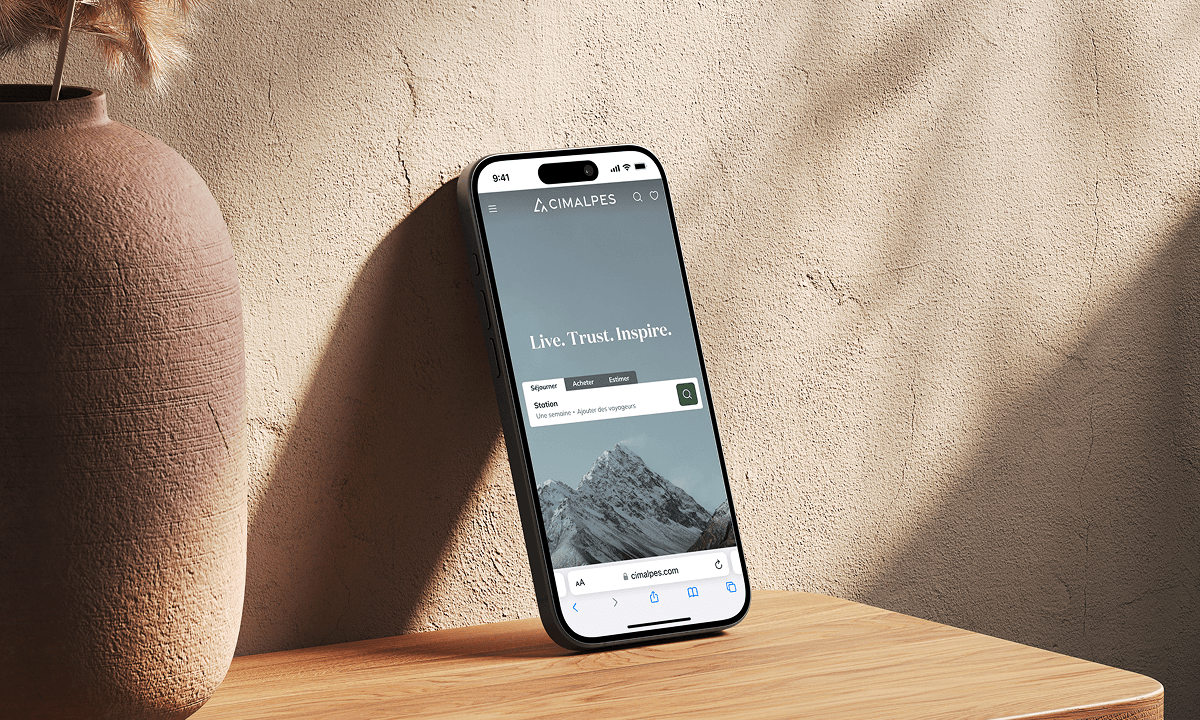
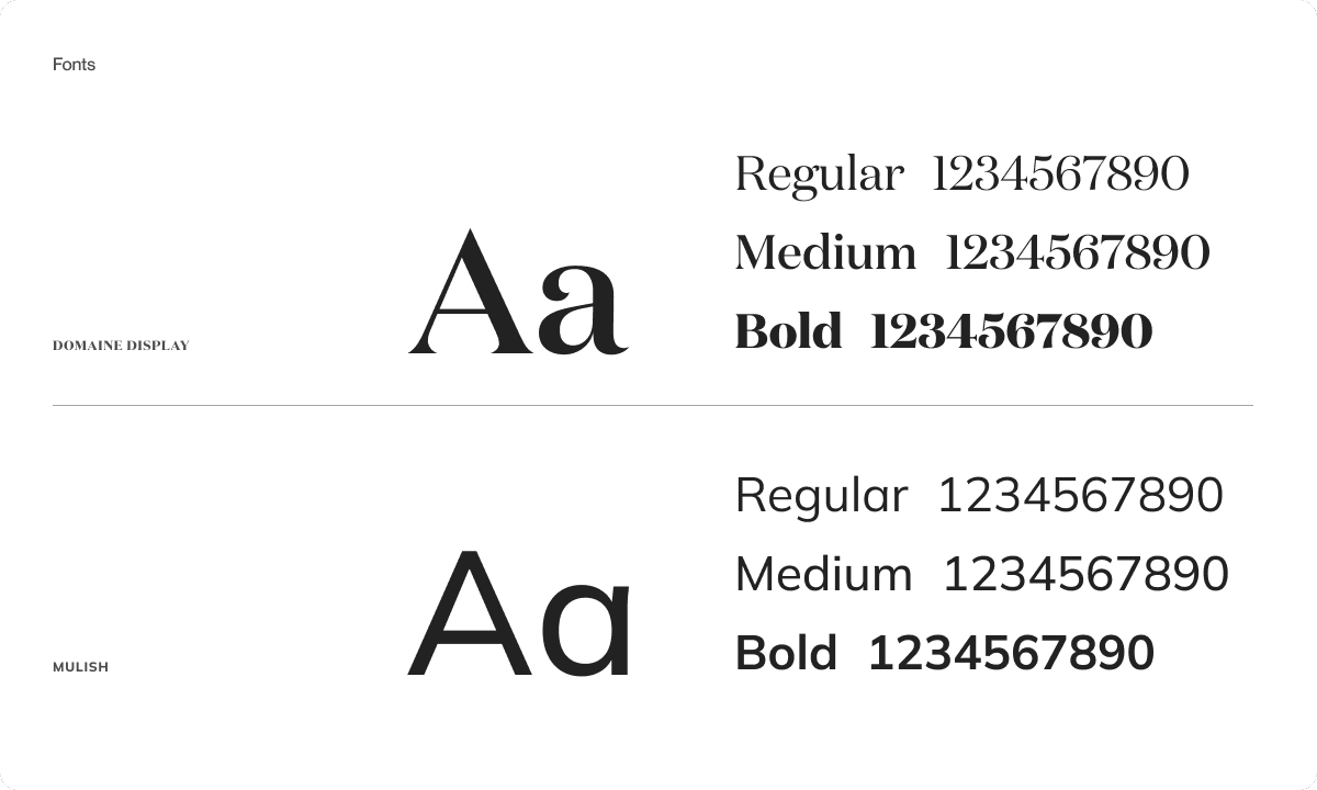
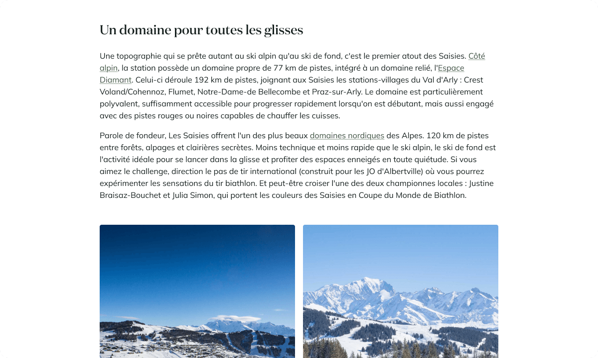
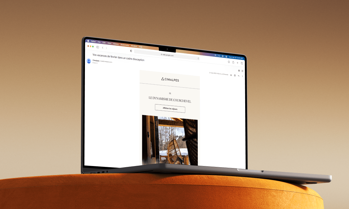
Typography: elevating elegance without sacrificing readability
Previous fonts (Montserrat and Roboto) lacked distinction and failed to convey the brand’s luxury aspirations. We introduced Domaine Display, a bold yet elegant serif for headlines, evoking both the serenity of mountain escapes and the gravitas of property transactions.
For body text, Mulish—a clean, modern sans-serif—was chosen for its readability and minimalist appeal.
Every typographic detail (spacing, line height, letter spacing) has been meticulously refined to reinforce the brand's premium image and ensure a pleasant reading experience.
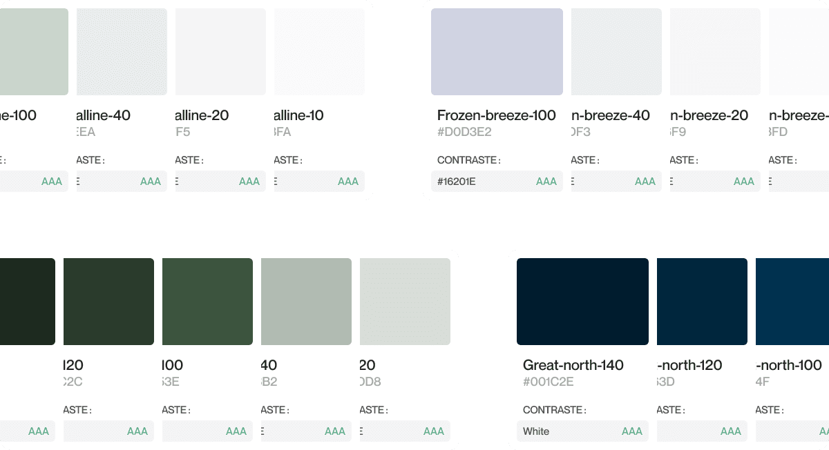
Color palette: sophistication through cohesion
The original palette suffered from weak contrast and mismatched tones, undermining visual harmony. We developed a comprehensive system featuring:
- Primary colors: Green (symbolizing rentals) and blue (evoking trust for sales).
- Secondary/Accent colors: Complementary hues to enhance versatility.
- Neutrals: Balanced tones for backgrounds and text.
Each color was expanded into light/dark variants, rigorously tested for WCAG compliance (AA/AAA ratings) to ensure accessibility across interfaces
Iconography: clarifying and unifying
Existing icons were overly intricate, rendering them illegible at standard digital sizes (e.g., 24px). The limited set also failed to cover all interface needs.
To address these challenges, I oversaw the work of Annecy-based studio Wanaka to design 300+ new icons that:
- Enhance visual consistency and versatility,
- Ensure optimal legibility at small scales,
- Unify the visual language for 2,000+ properties (amenities & services).

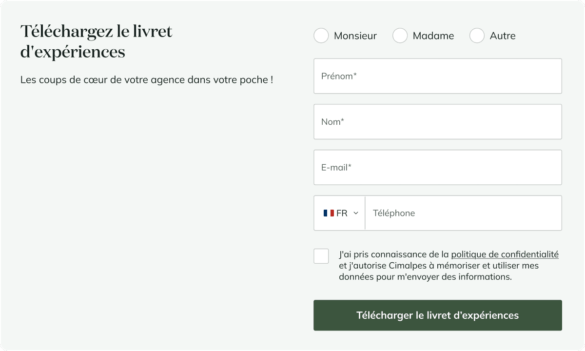
Buttons & Interactions: enhancing hierarchy and contrast
To streamline user actions, we introduced three button tiers:
- Primary (high-contrast, reserved for key actions like "Book Now")
- Secondary (outlined style for complementary choices)
- Tertiaire (text-only links for minimalist interactions).
Interactive states (hover, focus) were enhanced through subtle cues (color shifts, gradually appearing underline) to guide the eye and clarify actionable steps.
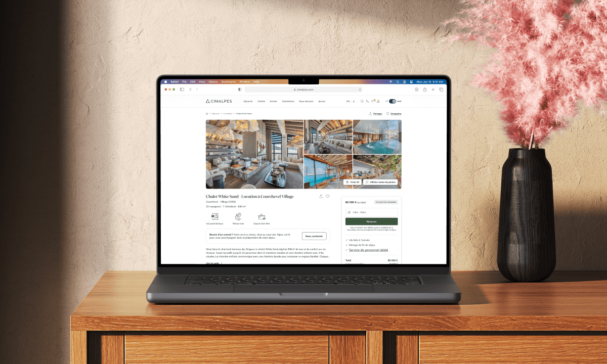
Layout & Grid: optimizing readability
Overly wide text blocks (1313px) forced uncomfortable head movements during reading. By reducing max-width to 800px, we enabled effortless eye scanning.
Images and videos were resized to integrate seamlessly within this grid, ensuring fluid responsiveness across desktop and mobile.
Before/after of a paragraph on the journal (blog)
Tone & Voice: contextual adaptability
Previously, a single tone was applied indiscriminately across all platforms. We introduced a dual approach:
- Aspirational and engaging: For inspirational content (headlines, newsletters, presentations), using emotive language to captivate.
- Factual and precise: For functional/sensitive contexts (payment alerts, forms), prioritizing clarity.
Nous ajustons également la personne grammaticale en fonction du type de message :
- "You": Direct address for impactful calls-to-action. Example: "Unwind in your private spa after a day on the slopes."
- "I": Personal ownership for user-initiated actions. Example: "I subscribe to the newsletter."
- "We": Brand voice for company communications. Example: "Our team crafts tailor-made experiences."
Title to the 2ᵉ person (‘You’), tick box to the 1ʳᵉ person (‘I’), infinitive button
Outcomes
The redesign successfully harmonized Cimalpes’ visual identity with its luxury positioning while simplifying navigation. The updated interface now delivers a more intuitive experience, where every design element and interaction reinforces the brand’s premium ethos.
User feedback highlights improved content clarity and smoother property discovery flows.
Chambéry, Savoie.
+ (33) 6 65 90 97 78
contact@benjaminzgr.com
© 2026 benjaminzgr.com